My media product uses many conventions that both develop and challenge forms and conventions of real media products. For example the title of my magazine comes from a song name by The Kooks; ‘Ooh La’. This helps reinforce the music theme within my magazine. Another magazine that has done something similar is the Rolling stone magazine. The magazine name itself is a song. My magazine has an indie theme to it and this is reinforced because of the Indie song name used as the title. Another similar convention my product has is the central close up image on the cover. Many magazines use close up images on the cover so immediately without opening the magazine the reader is able to develop a personal relationship with the celebrity which encourages them to become more curious about their life. The anchorage text on my cover also helps with this as it gives away more information on the celebrity and why their facial expression is how it is on the cover. I have used a black and white central image and the text and title on my magazine is in colour. The artist’s lips on my magazine are also in colour. The black and white looks dramatic so the close up image indicates that there is drama in the artist’s life that readers may want to know about. However, it also emphasises more on the coloured elements on my cover and helps them stand out. For example, the artist’s lips are red whereas, the rest of the image is in black and white. This helps us focus on her lips, which could suggest that she has something to talk about in the magazine that may interest us. The title block is also brightly coloured which enables it to stand out from the black and white image. This convention has been used to a minimum by magazines such as ‘Rolling Stone’ and ‘Q’ however; I have used it in great detail for my product which will make my product stand out from other music magazines. I have also used puffs on my magazine cover that inform the reader on the artists that will be in the magazine and the particular topic that will relate to them. This convention is also used in many magazines such as Q, Kerrang!, Rolling Stone and Mojo. Furthermore, I have used a barcode at the bottom of my magazine as well as the issue number, date and price of the magazine in small print. All these aspects are those that are used in other music magazines. Because of them my target market will know that it is a magazine and more specifically a music magazine (due to the usage of a guitar image at the corner of my magazine). However, my magazine does challenge the typical conventions as well. This has been done so although my magazine is recognised as a music magazine, it stands out against the other music magazines. There is no particular colour theme to my magazine. Although the colour combination used attracts certain types of people (16 year olds to adults) there is no on going colour combination used. This goes against a typical convention commonly used by magazines such as ‘Rock sound’ or ‘Kerrang!’. This keeps my magazine more interesting as I am planning to keep the heading the same colour so the next issue will still be recognisable but would look fresh because it will look different each time.
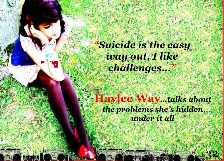
My magazine represents a few social groups, which mainly reflect my target market. Although my magazine is mainstream, in this particular issue, it focuses on representing young females from 16-26 that are going through problems in life. Although, this is not evident enough on the front cover as the artist looks happy in the image and the anchorage text does not imply anything associated with problems. But, my contents page and feature article help represent this because of the quote ‘Suicide is the easy way out, I like challenges’ from the artists interview which suggests the artist will be talking about deep issues such as suicide and her opinions on it. This could represent other females her age. My feature article gives more detail on the artist and how she considered committing suicide because of loneliness and image orientation. These topics are common amongst young British females and having the British artist talk about them and relate to them could not only help them with their problems but also, represent them. In addition to this, my contents page covers topics related to suicide and rehab (which could represent particularly females), band problems amongst male bands (which could represent human relationships amongst males) and new alternative music (which could represent alternative music fans). So, there are representations of a few social groups but, this particular issue focuses on young British females.
According to my research on audiences and institutions I would like Bauer Media to be the institution that would distribute my magazine. The media institution distribute mainstream magazines such as ‘Q’ and ‘Rolling Stone’ and more specific niche ones such as ‘Kerrang!’. My magazine itself is mainstream and the audience vary depending on the issue so it could be distributed by the company. Bauer also distribute 282 magazines in 15 countries including the UK so this will be beneficial as my magazine has a British Indie style to it. My magazine is influenced by magazines such as ‘Q, Rolling Stone and Mojo’ and all three magazines have been distributed by Bauer Media. Bauer is also one of the UK’s biggest publishing groups so if my magazine is distributed by the company it will sell in the UK. The company also own radio stations as well as websites. This makes it more popular as it reaches the target market in many ways. This could also help make individual products more popular as they have been produced by the company. So, if Bauer Media distributes my product my product will not only invite a larger target market to Bauer Media but will also, be recognised easily as it is produced by a famous distributor.
The audience for my magazine are both male and females from 16 years to adults. However this varies in each particular issue depending on the topics. In this issue the target audience is narrowed down to British females from 16 years to 26 that listen to rock, Indie in particular. It also targets the male audience at a smaller scale as my magazine covers topics on a male rock band, rap band and a female sex symbol; Britney Spears. This attracts a male audience. Although, my main topic is on a female, this may still attract males as they may want the magazine purely because of the female on the cover. Other magazines such as ‘Rolling Stone’ and ‘Q’ also do this. However, it will attract more females due to content of the feature article. This issue is targeted mainly at females but the stereotype of a magazine targeted at females is slightly subverted. The magazine cover does not talk about the typical issues females associate them selves with such as ‘hair, makeup and fashion’. Instead, it covers more serious heavy topics which could also interest a male audience.
In order to attract my target audience, the title of my product is a song by ‘The Kooks’. The band is British which gives my magazine a British Indie theme. This will immediately attract British Indie fans. The colours used on the title block are blue and red and greyish white which are similar to the colours on the union jack reinforcing the British theme and attracting British audiences. My magazine also uses bright colours such as blue and pink. This enables it to attract both male and females due the use of the traditional colour representations. Throughout my magazine there is no particular use of on going colour combinations. This helps attract a larger target market and doesn’t narrow it down. However, I have used a musical electronic item on the bottom of each page. To differentiate my front cover from the rest of the pages I haven’t used speakers at the bottom of the page and instead I have used an electric guitar. But, both speakers and electric guitars represent modern day music (mainly rock) and this would attract specific fans that may be into modern music or rock. I have used a bold font that is not complete to give my magazine a rough finished. I found this font at www.dafont.com and although it is capitalized for my title block, easy to read, it is not smooth from the edge which gives my magazine an impression of slight rebelliousness. Furthermore, I have used a variety of artists; both male and females which would attract both sexes to my magazine. The use of artists from different genres such as Rap and Hip Hop, Alternative Rock, Pop and Indie give my magazine a multiple genre balance. This invites more music fans. Lastly, the ‘Free Poster!’ give away at my magazine may attract both males and females as the artist is an inspirational female artist for female fans and may be attractive to male fans. This will also help attract my target audience.
I have learnt many things about the technologies from the process of constructing this product. I have mainly used Photoshop and Blogger. Different forms of technology that I am new to. I have learnt many things whilst using Photoshop. I learnt how to highlight particular parts of an image to cut it out as well as using the cloning tool. I also used the blur tool and crop tool which helped me make an image look smoother and resize it. I also used other tools such as the colour picker, the text tool, and the image sharpener. All these tools contributed to the professional look of my magazine.
I have also learnt many thins whilst using blogger. I felt it was important to me, to also focus on the colour scheme of my blog and match it to my magazine theme as it would help reinforce my magazine style through this. I found blogger easy to use and edit with as it has the basic tools such as adding images, adding text, heading space and basic fonts. It was also useful to create polls so I could receive feeback from school mates that are also part of my target audience (16+). The feedback received from the polls helped me pick out a suitable title block style which is one of the most important ways of attracting certain target audiences. So, creating a poll for this was useful. If I could redo this entire task, I would want to use adobe illustrator as I did not use it. Instead, I used the software ‘Paint’ which is not as professional looking as adobe illustrator.
Looking back at my preliminary task, I feel that I have learnt a lot in the build up to my final tasks. I learnt how to edit images to make them attract certain types of people or to create certain atmospheres and moods. For example I took different images in different locations where the mise-en-scene was important as, it would show the audience what type of celebrity she is and what her style is like. The editing of images helped me create a certain mood. For example, black and white images helped make the image look more serious and dramatic. I also learnt that different shots would build up different impressions of the artist. For example an extreme long shot would keep distance from the reader and artist only revealing general information. A high angle would make the artist look more vulnerable and the reader will feel more powerful. In order to keep my magazine mainstream, I looked at other mainstream magazines such as Q and Rolling Stone. I saw that their images used are often in black and white which gave the magazine a dramatic look. I learnt the function of black and white images and how it creates a particular atmosphere. I also learnt that most magazines used capital lettering for the title block and I also used this as from my research I found that it puts emphasis on the magazine name, adds importance and also makes it clear to read, bold and eye catching. I have also learnt that layout conventions are important and the colours of the layout are not as irrelevant as I would have thought. I’ve learnt that each particular colour used in a magazine is not just used for aesthetical purposes but symbolises something whether it is obvious or subliminal. I have mainly learnt that it is important to attract a wider target audience as you can possibly attract because the most important function of the magazine is for it to be interesting and money making. The best way to do this is through presentation (e.g. title blocks, layout, use of images/fonts), and use of artists and topics within the magazine. Another important aspect is the magazines cost. The cheaper the magazine is doesn’t always mean it will make less money because it is better to sell 4 cheap magazines that make £10 than one expensive magazine making only £4.
Wednesday, 12 May 2010
Tuesday, 11 May 2010


Monday, 10 May 2010


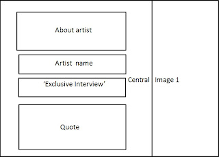
Magazine Interview pages (first draft)


 For my magazine pages i need to make many changes according to the feedback I have recieved. Firstly none of my pages have the page number on the corner this makes it harder for the reader to access the page directly. Therefore, I will add page numbers on my pages. Furthermore, the writing on the front page is spread out and the reader is unable to focus on the image at the back and the front page looks like an article itself. I will try to arrange the text in a way where it is small but clear to read.
Lastly, I do not have enough images on these pages and this makes the pages look boring as there is too much text and no images.

First draft contents page

According to target audience feedback, I have noted that my contents page requires many improvements.
Firstly, the background image consists of many colours and shades which makes interferes with the text on the page and makes it harder to read.
I will make the background image more simple and cut down on the colours using photoshop.
The contents of the magazine are listed with musician names and pages. However, the topics related to the musicians are not listed and this makes it less interesting for the reader as they are not aware of what articles the magazine may consist of. I will specify the topics on the final draft of my contents page.
The two images at the bottom of the page do not stand out of the background image and no caption is used. This may confuse the reader. I will make
the images are outline and have captions so the reader is aware of what they are associated with.
The quote of the main artist my magazine features is at the left hand corner of the magazine which places less importance to it. Also, the colour orange doesn't stand out well from the background image. I will change the colour of the text and reposition the quote.
The line 'Haylee...exclusive interview + free poster' is in the centre of the page on top of the artist themselves. The colour black is not bright and eye catching and I will have to change this so it stands out.
Wednesday, 5 May 2010

Music magazine cover 1st draft
 I will improve my magazine
cover in many ways due to feedback.
Firsly I will change the
appearance of the magazine price
(bottom corner,right hand side)
as it isn't visible enough. I will also
improve my magazine puffs
as they look like one story.
The name of the main artist
my magazine is featuring
(Hay-Lee) is not visible enough
on the cover (eg bright/
eye catching). I will also change this.
Tuesday, 4 May 2010
Magazine Interview
4 successful albums, 11 Grammy Awards and voted ‘Best singer alive’ by Vibe, Haylee Way talks about the problems she’s hidden under it all.
Solo Indie singer, lyricist and guitarist
‘I became fed up of everything, to the point where I considered killing myself.’
But, after working in the studio with King of Pop, Michael Jackson the Indie artist changed her perspective on life altogether. She claimed that ‘Suicide is the easy way out, I like challenges…’Haylee worked with singer Michael Jackson on her new album ‘Here Forever’ where both artists cover topics on their experiences with suicide and how they overcame them, aiming to inspire fans.
After 12 lengthy months of waiting, we have finally managed to bring
OL: This is already straight to the point, but we’ve all been dying to know why you left us a year ago. What happened on stage in the
Haylee: Well, believe it or not, I kind of got sick of all the attention being thrown at me from the press, fans and even other celebrities. I felt as if I had no one I could actually talk to and everyone that did talk to me had some sort of vested interest. You know, they wanted something from me. On top of it there was this pressure of trying to remain thin and maintain my appearance and that’s when the eating disorder took control.
OL: Eating Disorder?!
Haylee: Yeah, I drastically changed my diet ever week and eventually I’d throw up before concerts. That night in 2009 I just couldn’t sing half way through the song. There was this burning sensation at the back of my throat which was rather painful. I felt nauseous. That wasn’t the first time I went through one of those break downs. It all sounds so absurd.
OL: No, not at all. So…after that night, how did you sort these issues out, and how did you hide it so well the whole time?
Haylee: I got stopped focusing on music and my ‘famous side’ for a long time. I thought it would be the only way, I’d feel normal again and recognised for who I am as a person. Plus, the pressure of everything slowly died down. I knew I had to hide everything the whole time because if I showed any signs of me trying to keep up with this ideal image, it would influence my fans. That’s one thing I won’t do. I can’t be held responsible for thousands of my fans being as stupid as I was and trying to be something they’re not.
OL: Michael Jackson has also had his fair amount of problems. Has working with him influenced yours in anyway?
Haylee: Definitely! I was at this stage where I wanted to commit suicide. I thought it would be something I’d be remembered by too. But when working on some lyrics with Michael he told me about how he sees it as an easy escape route. Like chickening out of a dare. Life for me is a dare. I can go through with it and be proud. Suicide’s the easy way out. I like challenges.
OL: We hear stories of millions of girls around the world going through intense pressure of becoming this ideal image. As a role model, what would your advice be to them?
Haylee: Well, I’m just going to quote what Eminem just told me 10 minutes before this interview, because it’s really stuck in my head. ‘Be proud of who you are, and don’t let anyone tell you, you’re not beautiful’. And to add to that, I just think that everyone should look individual and that’s what makes you unique. I mean when I first got famous, that’s exactly what I was…Original. I didn’t have any kind of pressure on me and that’s when I was working at my best to be honest. As soon as I got involved in impressing the media everything messed up. Remember guys! The media’s out to get you. Besides, this magazine of course (Laughs).
OL: Great advice. Final question. You play guitar, write your own lyrics and you sing. You’re multitalented. What do you see yourself doing in the future…anything different?
Haylee: Well I’m not sure yet, this sounds crazy but I was doodling last month and I posted it up on my Myspace to see what the fans thought! They actually liked the rough comics I doodled so I’m thinking of getting better at that later on. Maybe in 3 years time. For now, I think I’m going to make up for my disappearance, and owe my fans back.
OL: Well all the best for you in the future, and we’re glad your career’s back on track and it’s all running smoothly again.
Haylee: No, thank you... I'm back in Britain, I’ve just gotten to know awesome artists like Eminem and the chocolates that were sitting in front of me tasted amazing, so I can’t really complain.


Title Block Analysis

Kerrang! is a magazine targeted at people from 15 + that listen to rock music. It is targeted at both male and female members. This block title is suitable for the audience because of its meaning, colour of the word, ad font style used. The font used has rough unfinished edges to give it an informal look. This invites target audience consisting of rebellious people. The capitalised font enables adds to the volume of the word ‘Kerrang!’ which is an onomatopoeia representing the sound of a guitar chord. The capital letters also, help make the title look bold, clear to read and eye catching. The rough outline of the font also looks as if it has been cracked in some way representing loud rock music and its effects. The use of the exclamation mark also adds to the volume of the title and gives it an exciting tone as well as adds informality. The colour black reinforces the idea of the genre being rock, as stereotypically, subcultures such as ‘Goths’ and ‘Emo’s’ prefer the colour. Therefore, these factors invite the target audience.
 Rolling stone is a magazine that covers music, politics and pop culture. The magazine covers multiple genres and is mainstream. The magazine title used, helps reinforce this. By looking at the magazine title we can’t tell what genre it may be about as it is not specifically designed in a manner where it invites people that listen to certain genres.
However, by looking at the font style and colour we can tell what type of audience it attracts without looking at the genre.The use of the colour red symbolises passion, anger, energy, and heat. These representations are very different from each other which suggest that the magazine could be inviting people different types of people. The primary colour is also vibrant, bold and eye catching so it is attractive and stands out. The use of shadowing gives the magazine title block a solid look as if it is made of metal to add realism to the magazine itself.
The font used is groovy looking and isn’t straight edged and sharp with curls at some points. This makes it look like it is flowing reflecting the way music flows. Also, the use of italics make the title look like its slanting towards one side which could connote the effects of music and how it makes a person move. The font isn’t fully capitalised but the first letter of both words is capitalized which adds to the formality and we can easily see that the words are not together although they are juxtaposed.
The magazine name originates from 1960’s American Blues musician, Muddy Water’s song ‘Rollin stone’. Because the magazine name is a song itself it suggests the magazine’s main focus will be music.
The title suggests that the target audience will be adults for this magazine. However it does not specifically suggest whether they will be male or female. The title is easy and clear to read which adds to the elegance of the magazine. Because the magazine name originates from an old song, we know that only the older generation will be more likely to recognise this and therefore, it may not be for under 21’s today.
 Like Kerrang!, the target audience for NME is for people that are mainly into rock music. However, unlike Kerrang!, NME is more sophisticated from the way it is presented (layout) and the use of lengthy articles. This makes it more suitable for 18+. It is directed at both male and female audiences grabbing a wider target audience.
'NME’ is abbreviation for ‘New Musical Express’. This immediately tells the reader that the magazine will be a music magazine consisting of modern day music. When said, NME also sounds as if it is representing the word ‘Enemy’. Not only does the magazine allow readers to discover new artists and music, but, also adds to the rebelliousness of the magazine enforced through its main promoted genre; rock. The use of 3 letters keeps the title short and snappy, so it’s catchy and easy to remember.
The block title is targeted at the 18+ audience and we can see this because of it’s aesthetical aspects. The use of the colour red connotes passion, anger, romance and energy. It is bright and bold and this enables it to stand out. The white outlines around the lettering helps it stand out from the black background as black and white are contrasting colours. The contrast amongst these colours could represent the contrast amongst subgenres within the magazine and diversity. The font used is formal and clear to read and the edges are sharp. This allows the magazine title to make a statement representing the statements that may be made within the magazine via the articles. The capitalization of all 3 letters allows us to see that the magazine is an abbreviation and builds up curiosity amongst readers towards what the abbreviation may actually refer to. The capital letters also add importance to all 3 letters keeping them eye catching and memorable.


Audiences and Institutions
Bauer is a group publishing 282 magazines in 15 countries with 6600 employees worldwide. The company publishes magazines on women’s interest, lifestyle, puzzles, films and TV listings. Because of the variety of magazines Bauer publishes, it is a mainstream company. However, it produces niche magazines such as FHM, Mojo, Q, Heat, Empire, Grazia, Take a break, Kerrang! and Rolling Stone. As well as producing magazines Bauer also produces other media such as Websites, Radio Stations (Smash Hits, 4 Music, The Box) and TV Channels (Magic, Kiss 100). Bauer is also one of the UK's biggest publishing group.

IPC Media
One of the

As a company BBC is not specifically only a company that creates magazines. It is mainly a company that broadcasts and spreads news. (British Broadcasting Cooperation). The company are involved in TV (BBC 1, BB2), radio (Radio 1) and have their own website.
Types of magazines made:
-Preschool: Balamory, Bob the Builder, CBeebies Weekly
-Preteen: Top Gear: Turbo Challenge, Doctor Who Adventures, It’s Hot, Top of the Pops
-Adult: BBC History, BBC Music, BBC Wildlife
BBC Magazines Aim at different audiences through different niche magazines within the production company. BBC magazine is the most mainstream out of four companies as it focuses on different age groups from preschool to adults and promotes its own TV shows and radio station through this. However it does produce magazines associated with health and living so it is the most varied production company.
 Development Hell
"Development hell" is a small media industry that is involved in films, games and other methods of promotion.
Development hell produce niche magazines: Mixmag and The word. Both music magazines are targeted at 18+.
Two types of magazines from Devlopement Hell
Both similar Genres ---> à Niche industrial brand
* Mixmag is a British dance music and clubbing magazine. It styles itself as "the world's biggest selling dance music magazine",Launched in 1982 in the
* The Word was launched in February 2003. It was the first magazine to come from Development Hell Ltd, an independent publishing venture set up by David Hepworthand Jerry Perkins, two former EMAP executives with more than 35 years combined experience devising, editing and publishing titles such as Emprie, Mojo, Q The company also produce the dance music and clubbing title Mixmag and owns the dance music networking site Don't Stay In.
The niche company mainly targets music fans that are over 18. Both Mix mag, and the word are magazines that are targeted at adults in association with a particular genre: Dance music (often related to clubs, hence the older target audience). The company could promote other aspects of it through its magazines. For example, its video games, comics and popular novels could be promoted via the companies magazines.
Planning my music magazine
Most of my respondents were above 16 so my magazine will be aimed at 16+ target market. This is a suitable age because, 16 year olds are young adults that are able to make their own decisions and will be more likely to purchase a magazine as they are independent enough. Furthermore, people above 16 will also be able to do this due to the same reason unlike under 16s, who are financially dependent on their parents, therefore less likely to purchase magazines in comparison to the 16+ target market. Most of my respondents were above 16 therefore; my magazine will be aimed at 16+ target market consisting of both males and females.
Although my magazine has no particular genre, to keep the target market bigger, it will have a rock style lay out to it as most of my respondents preferred that genre. Because the majority prefer rock music, my magazine will have an indie look to it to grab the attention of the majority. I have chosen the sub-genre indie within rock as it isn’t as narrow as subgenres such as heavy metal or alternative rock. Indie style is subtle and therefore the magazine will not look like it is specifically a rock magazine. So, it will invite a larger target market. The genre ‘Indie’ is an abbreviation for the word independent. This style would be suitable for my target market as the 16+ target market are generally independent. Indie is also a popular genre in the
My magazine is a British magazine, and I have also chosen an Indie look to give it a British feel.
My questionnaire results also tell me that most of my respondents purchase magazines and pay from £1.50-£2.50 for their magazine. Therefore, I have decided to keep the cost of my magazine to £2.50 as it is in between £1.50 and £3.50. So, it will be affordable for my target audience as it isn’t too expensive so 16+ teenagers will be able to purchase this. However it isn’t too cheap as, the 21+ adult target market will be able to purchase this as they are more independent and likely to earn their own money.
The magazine issues will be released monthly, as most of my respondents preferred this. If the magazine is released weekly it would mean that it would be harder to entertain the regular readers of the magazine and keep different interesting articles each time without, running out of issues to write about. The same issue would lie with having it released every two weeks. However, if the magazine is released monthly, it will be more likely that the readers will purchase it as they will wait a month before reading new interesting articles. Therefore the will expect good articles and would purchase the magazine. Also, it is easier to release the magazine monthly as it gives you time to collect interesting information to reveal every month so the magazine contents do not get boring, predictable and repeated.
Most of my respondents prefer a mixture of bands and solo artists on the magazine. So, I will use both bands and solo artists on the magazine as it will invite people that prefer bands and individual musicians. Also, if I use both it is more likely that my magazine will remain interesting and grab the reader’s attention because the bigger the variety of musicians used the higher the variety of audiences interested in the magazine because of them. Also, my respondents preferred both new artists and established ones on the magazine. This is beneficial because, they are more likely to remain interested if the magazine is promoting new musicians. As well as this, they will be able to get information on established musicians also.
I will be calling my magazine ‘Ooh La!’. This is because most of my respondents preferred this. Unlike other names suggested on my questionnaire, this name does not specify what genre the magazine is. The name sounds as if someone is singing and the exclamation mark adds volume and excitement to the name. It is also a famous song by The Kooks, a British Indie band. So, my target market is more likely to pick up the magazine for either one, or both of these reasons. The name doesn’t specifically attract target audiences that prefer one genre to another, but simply adds to the Indie style of the magazine.
50 percent of my respondents are content with keeping promotions and competitions in the magazine however 50 percent are not. However, I have decided to keep some promotions and competitions within the magazine so, readers may pick up the magazine purely to enter competitions. Furthermore, most of my respondents have preferred freebies in the form of posters and CD’s. Therefore, I will be using either a poster or CD freebie in my magazine depending on the issue.
My magazine will be mainstream like Q, Mojo or Rolling stone magazine as the genre used within the magazine varies depending on the issue inviting a greater number of people to purchase the magazine. My magazine will consist of many images aswell as textual articles because it is British magazine. Britain is multicultural and music is a universal thing. So, although some readers may be foreign and unable to read the magazine because they cannot read English well, they will also be able to recognise what's going on in the magazine via images used. Also, it will consist of articles and images and will be ergonomically well designed so it easy to carry and hold as well as concise when it comes to reading the magazine.
Subscribe to:
Posts (Atom)
